.webp)
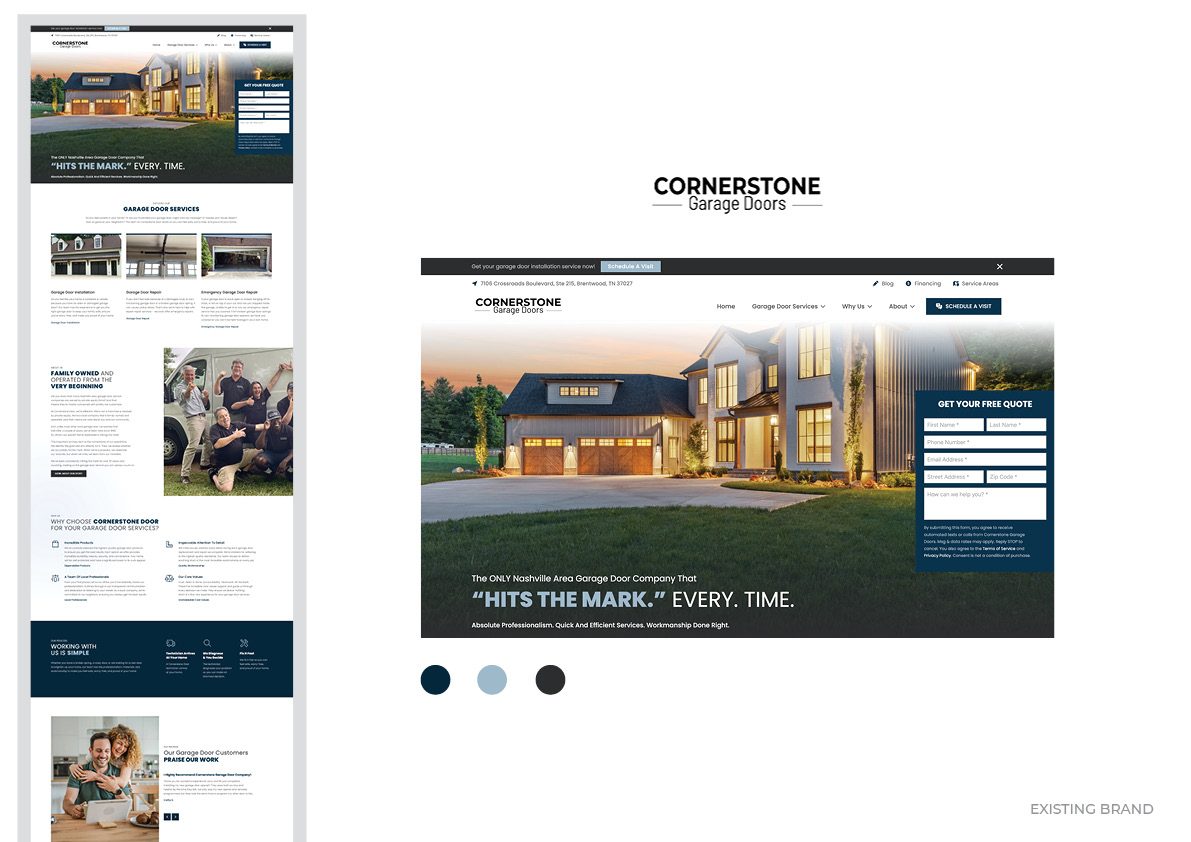
For years, Cornerstone Garage Doors was a solid, dependable name in the Tennessee garage door market. So when the team behind Cornerstone decided it was time for a bold new chapter, they didn't just want a new name. They wanted a brand with a soul - one built to scale nationally, told as a story, and impossible to confuse with anyone else in the category. The result is Dad & Daughter Garage Door Service, an incredibly rewarding project for Elastic Studio.
A strategy worth building on
This rebrand started in exactly the right place: strategy. The Ryan Chute Group did the foundational work — the positioning, the market thinking, and the name itself - and it's a genuinely brilliant one. "Dad & Daughter" instantly does three things at once. It signals family-owned and trustworthy. It promises something warmer than the typical trades brand. And it sets up a story - a real, ongoing narrative about a father and daughter building something together - that can carry the company across radio, advertising, vehicles, uniforms, and community touchpoints for years to come.
Once that foundation was in place, the Ryan Chute Group brought Elastic Studio on board as their creative partner to bring it to life — to take that strategic platform and give it a face, a voice, and a visual system strong enough to carry the weight of that story. One that would work as well on a van in a driveway as it would on a billboard, a t-shirt, or a business card.
The "best of both" concept
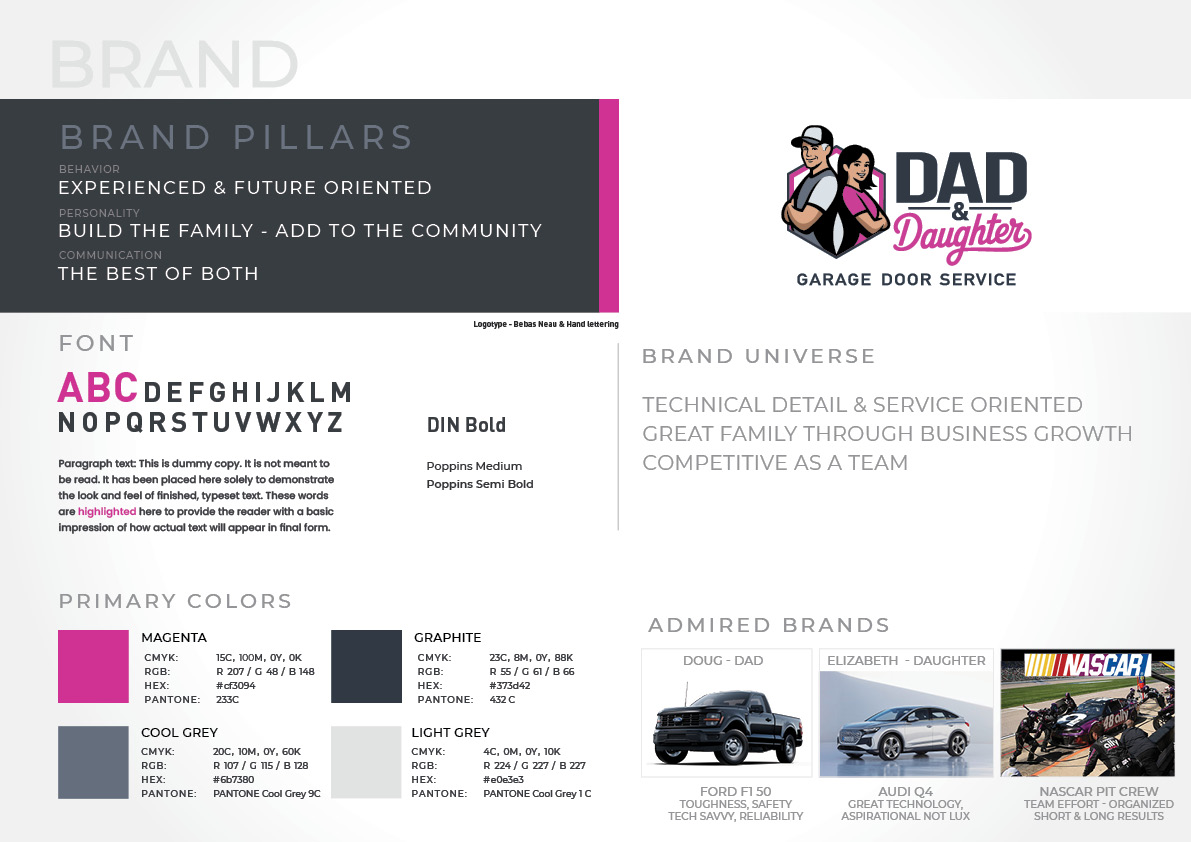
The heart of the brand comes down to a simple but powerful idea: book smarts meets street smarts. Dad brings decades of hands-on, hard-earned installation expertise - the guy who leads a team that can can diagnose a garage door problem and delivers precision work. Daughter brings a university education and sharp business acumen — the person modernising operations, building the customer experience, and thinking about where the company goes next.
Crucially, this is a partnership of equals. One of the clearest creative briefs we worked from was an explicit rejection of the tired "dumb dad" trope so common in family-business branding. Neither character outshines the other. They stand back-to-back, arms crossed, equally confident - a visual handshake that says "we've got this, together."
"Tough and technical, but never flashy for its own sake."
To find the right tone, we looked at brands and cultural references that captured this dual identity: the rugged dependability of a Ford F-150, the understated sophistication of an Audi Q4, and the disciplined teamwork of a NASCAR pit crew — tough, technical, and tightly coordinated. That blend of toughness and intelligence, of blue-collar and white-collar, became the DNA of everything that followed.
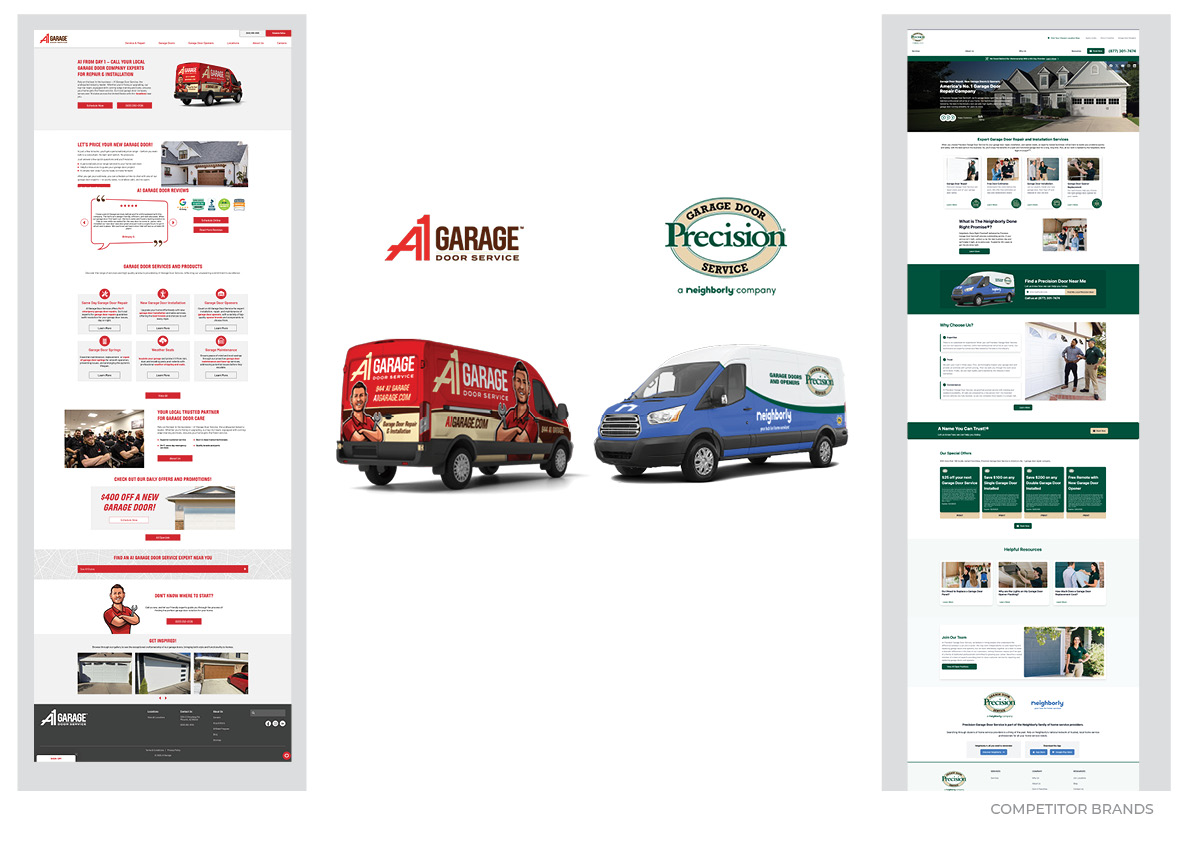
Standing out in a crowded, colourful market
Before a single pixel of the new identity was designed, we did our homework. The residential garage door category in the region is dominated by two major players - and both of them lean hard into bold reds, oranges, and deep blues and greens.
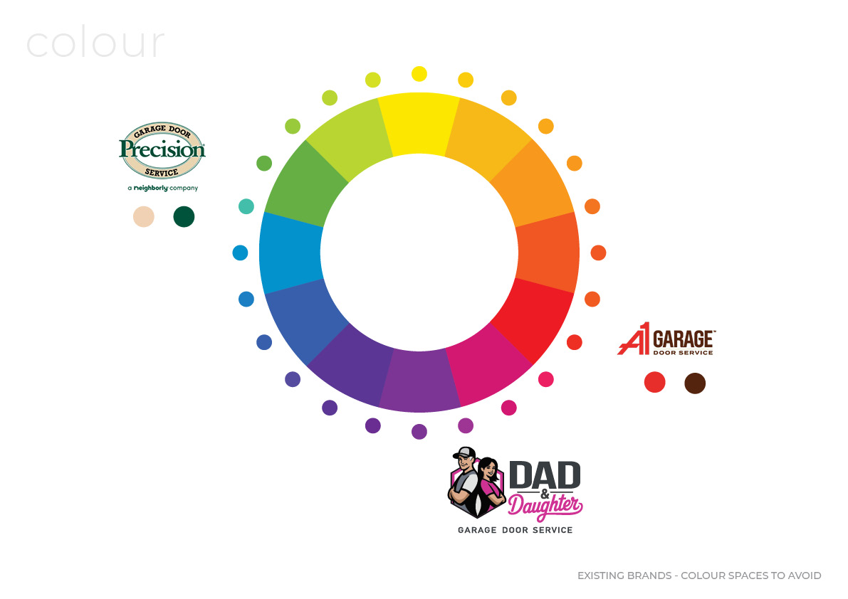
We mapped out the colour territory these competitors already owned and made a deliberate decision to go somewhere else entirely. The result is a palette built around deep graphite and a confident, saturated magenta — a combination that simply doesn't exist anywhere else in this market. It's bold without being garish, premium without losing approachability, and — most importantly — it's instantly recognisable from a distance. In a category where visual space has been very well owned, Dad & Daughter looks like it belongs to a different, better-run business altogether.
Characters worth remembering
At the centre of the new identity are Dad and Elizabeth (Daughter) themselves, illustrated as a mascot pairing that's warm without being cartoonish, and professional without being stiff. We explored dozens of reference points — from classic American mascots to modern tech brand characters — before landing on a style that feels approachable, contemporary, and built to age well as the brand scales.
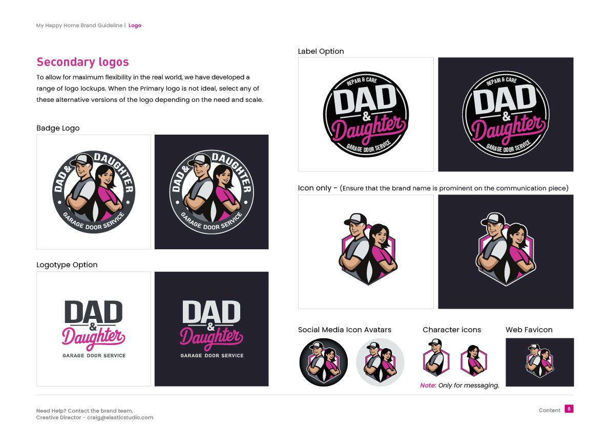
The badge-shaped icon nods to craftsmanship and structure — the kind of mark that feels at home on a uniform patch, a van door, or a hard hat sticker. Bold, uppercase "DAD" typography brings strength and durability, while "Daughter" is rendered in a confident retro script that adds warmth, personality, and a touch of nostalgia. Together, they create a logo that reads instantly, even at a glance from a moving car — which, for a brand whose vans are its biggest billboards, is exactly the point.
A system built to do the heavy lifting
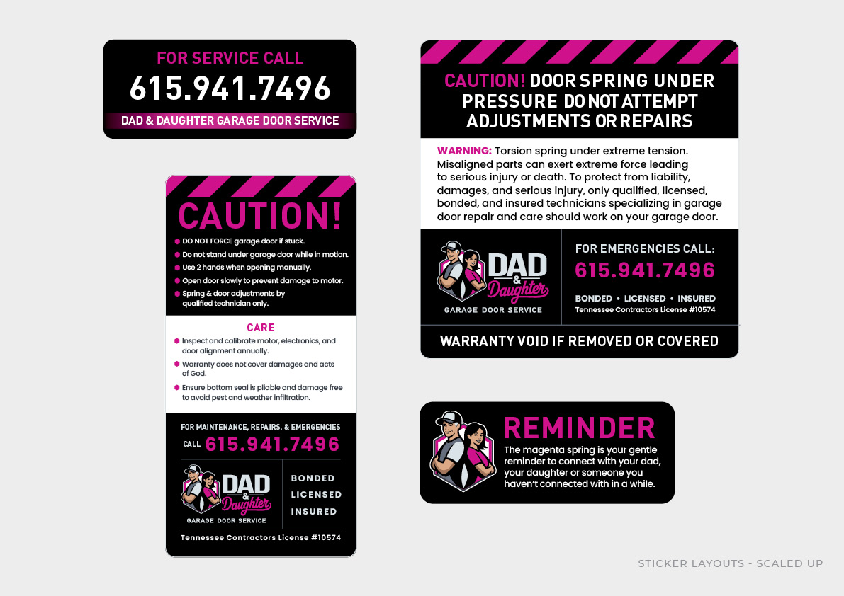
A great logo is only the start. What makes a brand actually work in the real world is the system behind it — and that's where we spent much of our time. We developed a full identity architecture: primary and secondary logo lockups, a badge version, a circular "repair & care" stamp, social media avatars, and standalone character icons for messaging and community communications.
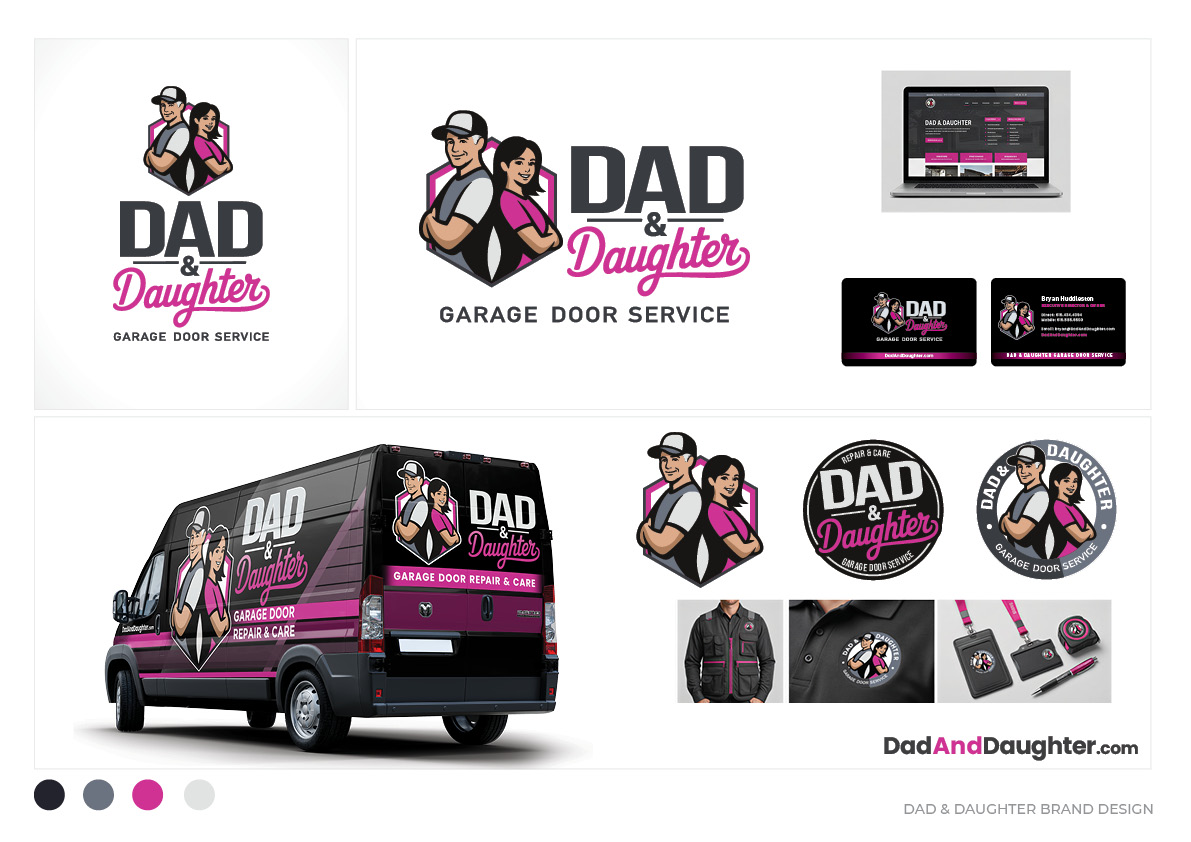
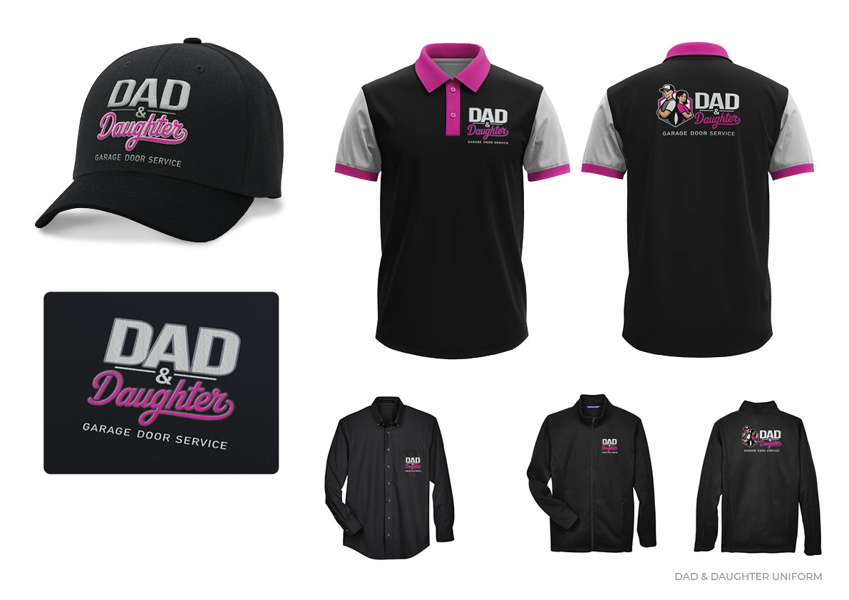
Then we put it to work. Full vehicle livery designs for a Ford Transit van and a RAM 1500 pickup bring the characters and colour palette to life on the road - bold enough to be seen from blocks away, but cohesive enough to feel like one unmistakable brand. Uniform designs carry the magenta-and-graphite palette through polos and caps, with the characters embroidered front and centre. Business cards, letterhead, and a full digital brand guideline round out a toolkit built so that — whether the company adds five vans or fifty - every new touchpoint looks like it was made by the same confident, considered hand.
This is the part of branding that doesn't always make it into the highlight reel, but it's the part that determines whether a rebrand actually sticks: a system robust enough that the brand stays consistent as it grows, scales, and reaches new markets.
A brand built to travel
What started as a local Tennessee garage door company rebrand has turned into something with genuinely national potential - a brand designed from day one to be "elastic" enough to grow, distinctive enough to be remembered, and warm enough to build real community loyalty along the way. That's exactly the kind of project we love: strategy, story, and design system working together, each making the other stronger.
If your business is going through its own evolution - whether that's a full rebrand, a market expansion, or simply a brand that no longer feels like it fits - we'd love to talk. If you're a US-based company thinking about what's next for your brand, get in touch with Elastic Studio.
We'd be glad to show you what's possible.
Craig Murley
Share this:

.webp)


.webp)
.webp)
.webp)
Nothing to see here!
Nothing to see here!